Everything You Should Know About Google Page Experience Update in June 2021
Google Page Experience Update in June 2021 shall affect Core Web Vitals
Last November, Google announced that page experience signals which combine Core Web Vitals and existing search signals will be rolled out in May 2021. During the announcement, Google clarified that they will be prioritizing web pages with great page experience and testing visual indicators that may enhance this experience. At the same time, Google released a variety of tools that publishers could start using in order to improve their page experience.
Google also announced that non-AMP content will be eligible to rank on the mobile Top Stories feature in search from May 2021. While they stated that they would continue to support AMP and link to these pages whenever available, removal of AMP from top stories eligibility will allow more websites that offer exceptional user experience to rank on this featured section in search pages. We’ve covered more on this announcement in our article here. Read through to better understand the page experience signal and how you can identify opportunities on your web pages to improve.
[table_of_contents]
The gradual rollout will start mid-June 2021
Now in April 2021, Google has announced a few key updates on the page experience ranking change. They unveiled plans to start rolling out page experience as part of their ranking signals gradually from mid-June 2021. They expect these ranking signals to be fully rolled out by the end of August. Google plans to roll out this important update gradually over a period of about three months instead of implementing the changes all at once.
They’ve clearly restated in this announcement that they shall continue to focus on page experience as one of their key ranking factors. Website owners who have been focusing on great user experiences shouldn’t expect drastic changes after the rollout. The purpose of the gradual rollout is to take note of any unexpected or unintended issues and address them before they have a bigger impact.
Google advised website owners to continue making changes on their websites with page experience in mind as they wait for the rollout. The search engine has been gathering feedback from website owners, answering questions and providing helpful guidance on ways to improve page experience.
What will be included in new Google search algorithm update?
Once the update is rolled out, all news content that meets the Google News policies will now be considered in the Top Stories carousel feature on Google Search. News websites will no longer be required to use the AMP format in order to feature on this section. Now pages will be eligible to appear on this Top Stories carousel regardless of their Core Web Vitals score or page experience status.
The new update will also include some noteworthy changes on the Google News app. Non-AMP content will now also feature on Google News app as part of the experience update. Google will no longer be displaying the AMP badge, which helps distinguish AMP content.
The update will also consider the three Core Web Vitals metrics. From SEO point of view these are more important for online marketing, so let’s look into vital metrics in details.
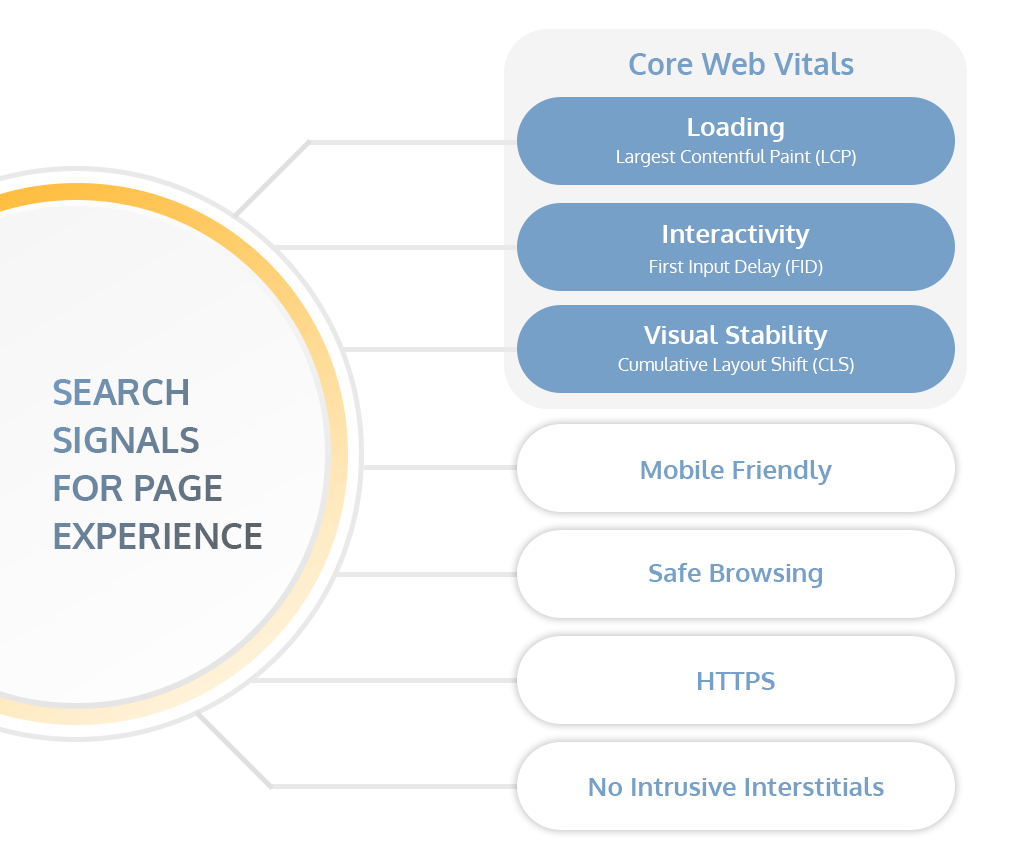
What are Core Web Vitals metrics?
The 3 core web vital metrics are LCP, FID & CLS. These three Core Web Vitals metrics evolve over time but generally focus on loading, interactivity and visual stability of web pages. They came about as part of Google’s initiative to provide guidance on signals that are essential to delivering great user experience on the web.
- Largest Contentful Paint (LCP): This measures page load time by looking at when the largest element of the page was rendered. Sites that offer a good user experience should have an LCP of 2.5 seconds or less.
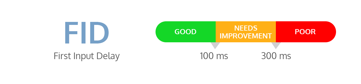
- First Input Delay (FID): This metric helps to measure web user’s first impression of a site’s interactivity and responsiveness. It measures the time a user interacts with a page (e.g., from when they click a button or link) to when the browser starts processing the event in response to that interaction. A good FID score is 100 milliseconds or less.
- Cumulative Layout Shift (CLS): This metrics looks at unexpected layout shifts that occur during the entire lifespan of the webpage. Layout shifts are those changes in position of visible elements from one rendered frame to the next.
These core web vitals apply to all web pages and should be measured by all site owners. Each represents a unique aspect of user experience that is measurable and reflects on their real-world experience. To ensure you’re hitting the recommended target for each of the metrics mentioned above, focus on the 75th percentile of page loads.
As specialists in law firms SEO and marketing, we use several tools to measure Core Web Vitals compliance, such as the Chrome User Experience Report, web-vitals JavaScript library, Chrome DevTools and Lighthouse. Once we’ve measured the Core Web Vitals, we identify areas of improvement and then go on to optimize the web pages for each of the Core Web Vitals. We’ll share some ideas below on how we optimize each of these metrics. You can also see how our website is doing via Google Search Console in Page Experience section.

How to Optimize LCP
One of the main factors that contribute to high bounce rates on most web pages is a long load time. If it takes too long for users to see any content on the screen, most people will click away. There are two main metrics used to measure the time it takes for content to render on a screen – FCP and LCP.
Unlike LCP, FCP or First Contentful Paint measures the length of time it takes for the initial DOM content to be rendered. What it fails to tell us is how long it took the largest and often the most meaningful content on the page to render. This is where LCP comes in.
As one of the Core Web Vitals, Largest Contentful Paint (LCP) is a metric used to measure how long it takes for the main content on a web page to completely render on the screen. The metric varies between 2.5 to 4.0 seconds for most websites. Pages that have an LCP of 4 seconds and more are considered to offer a poor user experience.

There are 4 main causes of poor LCP. We’ll look at them below and provide ways to improve this metric.
Slow server response times
Your website browser receives content from web pages from different servers. If it takes too long to receive this content from the server, this results in a poor LCP. Fast server response times automatically enhance all page load metrics, including FCP and LCP.
There are several things that you can do to improve how and where your server handles your content. First, begin by determining your server response time. This is measured by using the Time to First Byte (TTFB) metric.
- Optimize server
To start off, ensure that your website isn’t running expensive and time-consuming queries that take too long to complete. Sometimes web pages have complicated operations that happen on the server-side and, in turn, bog down the entire page. It takes too long to return page content. In order to improve the time it takes your browser to receive data, you may want to consider serving static pages that are already ready when the browser requests it. If you have to serve your web pages dynamically because some components need to be generated into markup by a UI framework, then identify other ways to speed up this process.
- Route users to a nearby CDN
CDNs or Content Delivery Networks are a network of servers that are designed to distribute content to multiple separate locations. It’s more likely that your website will load slower if the content is being hosted on a single server. This is because browser requests have to travel a longer distance for those users who are geographically farther away from the server. By using a CDN, your users will enjoy faster speeds because the servers are distributed in several locations all over the world. Network requests don’t have to be sent to faraway servers.
- Cache assets
This is a great solution for web pages with static HTML. Caching assets of the page helps to avoid recreating the HTML after each request which ultimately reduces TTFB and utilizes minimal resources. Server caching can be applied in many different ways, such as configuring reverse proxies which will serve the cached content when installed in the server. You may also consider using applications that configure and manage your cloud provider’s cache behavior. Another solution is to invest in a Content Delivery Network that offers edge servers. These servers are designed in such a way that your content is cached and stored close to your users.
- Serve HTML pages cache-first
Another solution to lower server response time is to cache some or all of the HTML page’s content and only make updates to the cached content when necessary. This is done by using a service worker that runs in the browser background. The application only updates the cache whenever the content changes. This solution can reduce LCP considerably.
- Establish third-party connections early
If the server request is being sent to a third party, this can significantly affect LCP. This is especially the case when there’s critical content that needs to be displayed on the page. A good work around this is to use rel=“preconnect”. This will immediately notify the browser that your web page is looking to establish a connection. Another option is to use rel=“dns-prefetch”. Both will work, but you can add the prefetch option, which comes in handy on browsers that do not support preconnect. You can apply both functions on your header as shown below:
<head>
…
<link rel=”preconnect” href=”https://example.com” />
<link rel=”dns-prefetch” href=”https://example.com” />
</head>
Render-blocking JavaScript and CSS
Another major cause of poor LCP is render blocking resources. The most common are synchronous JavaScript tags and external stylesheets that delay FCP and, in turn, result in poor LCP. If you want the main content on your web page to load faster, you must take steps to defer any non-critical Javascript and CSS. This can be done in several ways.
- Minify CSS
There are characters within CSS files that are absolutely unnecessary for browsers. They include comments, indentation and spacing. These may be essential in making your CSS files legible, but they may bog down your load speed if not minified. Minifying these characters will help reduce these blocking CSS and allow the main content of the page to render faster. There are different plugins available that you can use to minify CSS on every build.
- Defer non-critical CSS
Your web pages could be having unused CSS that’s bogging it down. Chrome DevTools has a Coverage Tab that helps to identify any unused CSS. You can choose to completely remove the unused CSS or move it to a different stylesheet if used on a separate page of your site. Another option is to load the files asynchronously.
- Inline critical CSS
If you have CSS for above-the-fold content, you can include it directly in <head>. This will eliminate the need to make another request each time to fetch critical CSS. To avoid having to manually add these inline styles to your website, you can use a library that automates this process. Good examples include the Critters plugin, Penthouse and CriticalCSS which are designed to extract and inline any above-the-fold CSS on your web pages.
Slow resource load times
Paint times can also be affected by the time it takes to load other types of resources, not just CSS or JavaScript. Some of these elements that affect paint times include <img>, <video> and elements with a background image that’s loaded via a URL function. There are, of course, ways to optimize your code and ensure files that contain these elements are loaded as fast as possible. We’ll go over some 4 options below:
- Optimize and compress images
Start with, often the easiest step, which is to compress the images on your site. Most websites have hero images, carousels, banner or product images that take the longest time to finish loading. There are several ways that you can optimize these images and directly speed paint times. We’ll share a few tips below:
– Remove images if they aren’t relevant to the content. The fewer images you use on your page, the faster it will load.
– Always compress images before uploading. There are plugins that you can install to automatically compress images on your website.
– Convert your images into a different format, such as JPEG 2000 or JPEG XR, which loads faster.
– If you have too many images on your website, consider investing in an image CDN.
- Preload important resources
You may also consider prioritizing the most important resources and making sure these are fetched sooner. For instance, if you have your fonts hidden in one of the many CSS files, you can prioritize this by using <link rel=”preload”>. This will ensure that it is preloaded and fetched sooner than all the other resources needed for that web page. Critical resources on web pages include fonts as well as above-the-fold images and videos.
- Compress text files
Large text files can also lead to higher paint times. To reduce the size of text files, you may use compression algorithms like Gxip and Brotli and make the process of transferring them between the server and browser much quicker. Check which compression algorithm is supported by all major browsers. Keep in mind that there are servers that automatically compress text files. Most CDNs and hosting platforms have a special feature that compresses files by default. However, if your server doesn’t have this and you’ll need to modify it to compress files, consider using an algorithm like Brotli that offers better compression ratios than GZip. The best practice is to compress the assets during the build process. This helps to avoid delays when requests are made.
- Cache assets using a service worker
Service workers can be used to help serve smaller HTML responses. One way to use service workers to help in improving paint times is to precache critical resources. This is especially ideal for those web users who will be trying to access your site from areas with weaker connection. Workbox is a good example of a service that you can use to update your precached assets.
Client-side rendering
To minimize the impact on LCP, you can optimize how the site is rendered on the client. This is particularly critical for websites that use client-side Javascript logic to render pages on the browser. Without these optimizations, it takes a lot of time for users to interact with any content on your page until the critical JavaScript has finished loading. We’ll share some optimizations that you can quickly implement when building a client-side rendered site.
- Minimize critical JavaScript
There are many cases where content can only become visible on your site when a certain amount of JavaScript has finished downloading and executing. The only way to reduce this time is by reducing critical JavaScript on your web pages as much as possible. To optimize, consider minifying these scripts or deferring any unused JavaScript to render faster and consequently improve LCP.
- Use server-side rendering
Once you’ve taken steps to minimize the amount of JavaScript on your pages, the next thing is to consider combining a server rendering experience. All this will help you to optimize LCP as much as possible. This works by allowing the main content of the page to first render on the server and then enhancing this static HTML content with client-side JavaScript via React Hydration. Though this concept can help to improve LCP, it comes with a few drawbacks. First, it increases the complexity of the application because both HTML and JavaScript files are rendered on the server and the client. Secondly, this can ultimately increase the server response times (TTFB). The response time is usually much lower when the server is just serving static pages. Lastly, users can only interact with the server-rendered page when all the client-side JavaScript has fully executed. This means that the page’s TTI or Time to Interactive metric can become worse.
- Use pre-rendering
Considered a less complex technique than server-side rendering, pre-rending works by generating static HTML files during build time. This concept has been known to help optimize LCP in several applications. Once the static HTML files of every route are generated, they are shipped along with the JavaScript bundles needed for that application. Even though this technique may still contribute to worse TTI, the server response times will not be affected because each page is rendered dynamically only after a request is received.
How to optimize FID
Another one of the three Core Web Vitals, First Input Delay or FID, measures how quickly a page responds to user interaction. This is a metric that helps us understand the user’s first impression when they visit a web page. It’s a measure of a site’s interactivity and responsiveness. FID calculates the time it takes for the browser to respond when a user first interacts with a page. To measure this response delay, there has to be a real user interaction. This is not a metric that can be simulated in a lab environment. Generally, when Total Blocking Time or TBT improves, it results in instant improvements in FID.
One major cause of poor FID, and consequently poor paint times, is heavy JavaScript execution. The best way to improve FID is to start by optimizing the way JavaScript parses, compiles and executes on your web pages. This is because when the server is still executing JavaScript, it cannot respond to any user interactions. Dealing with heavy JavaScript execution is, therefore, by far the easiest way to improve FID. There are 4 proven ways to address heavy JavaScript execution:
Break up Long Tasks
Assuming you’ve already taken steps to minimize JavaScript and reduce the amount that loads on each page, the next step is to break down long-running code into smaller tasks. To identify long tasks, look at any piece of code that takes longer than 50ms to parse. This can be split into smaller asynchronous tasks. In many cases, these long tasks simply indicate that your page is loading and executing more JavaScript than your user may need at that moment. By splitting these long tasks, you reduce input delay on your website and help improve FID. As specialists in law firms SEO and marketing, we implement best practices like code-splitting when building web pages to split long tasks in order to reduce load times.
Optimize your page for interaction readiness
Webpages that rely heavily on JavaScript can have heavy execution times, which slows down how they respond to user input, consequently impacting FID. In order to improve interaction readiness, consider loading the code and features progressively. This will spread this workout by reducing execution times. The best approach is often to generate more content statically during build time. Avoid server-side rendered apps that often block user interactions because they have large scripts that need to be executed.
Additionally, beware of third-party scripts that need to be executed because they often delay interaction readiness too. For instance, if you have third-party tags and analytics on your web pages, they can keep the servers busy and make your main content periodically unresponsive. One way to avoid this is to implement on-demand loading of these third-party scripts. For instance, below the fold ads can only be loaded when the user scrolls closer to that section. You also need to look out for third-party scripts that are prioritized on the main thread and end up delaying interaction readiness. Ensure that the scripts you prioritize on your web pages offer the greatest value to your web users.
Use a web worker
Main thread blocking is one of the most common causes of site unresponsiveness. In most cases, every browser tab has only one thread. This main thread is designed to do the work of rending our sites and running JavaScript. As a result, the main thread is often overworked and becomes a huge bottleneck for performance. It’s important to understand that the time it takes to run code on the main thread varies from user to user because the device capability has a major impact on performance. As users access the web using multiple devices, it will become even more unpredictable to measure this time. A web worker interface allows you to run JavaScript on a background thread. This will minimize blockages on your main thread and therefore avoid any input delays. There are different ways that you can move your non-UI operations to a separate worker thread or what we call the background thread. The easiest and fastest way to get this done is by using a library such as Comlink.
Reduce JavaScript execution time
Another way to address heavy JavaScript execution is to reduce the amount of JS on your page. This consequently reduces the time it takes for the browser to execute JavaScript code allowing it to begin responding to the user’s interactions. For this optimization, you have two options:
- Defer unused JavaScript: First, prioritize loading code that is required by the browser to respond to user input. Keep in mind that whenever the browser comes across any JavaScript that is linked to an external file, it must pause, parse, compile and execute the script first. Deferring this will improve response times immensely. You can identify unused JavaScript by looking at the coverage tab of Chrome DevTools. You can use “async” or “defer” to defer any non-critical JavaScript or content that is not needed above the fold. Another option is to code-split a large chunk of JavaScript bundle into multiple smaller chunks. This will allow lazy loading, which fetches only what’s needed when the initial page loads and the rest is only fetched when needed.
- Minimize unused polyfills: Polyfills are critical if you need your modern JavaScript syntax to work in older browsers. However, including these polyfills can undermine your page’s performance. This is because the newer modern APIs in current browsers don’t need to download it because they don’t need it. To optimize your scripts, minimize some of these unused polyfills and restrict their usage to only those environments, typically older browsers, that need it. Include polyfills only for the browsers you intend on targeting.
How to optimize CLS
Ever had an experience where you’re about to click something on a web page, then it moves? How annoying, right? Layout shifts are not only frustrating to users but can be detrimental to your page’s ranking capability. They contribute to a poor user experience. Layout shifts often occur when visible elements on the web page are suddenly added to the page or resized.

As one of the Core Web Vitals, the Cumulative Layout Shift or CLS measures just how often these shifts occur on your web pages. This metric seeks to determine the instability of your website content by summing all shift scores across the page that occurs within 500ms of user input. This metric focuses on how much the content shifted in the viewport together with the distance these elements were shifted.
We’ll go over the common causes of layout shifts that result in a poor CLS and how to address them:
Images without dimensions
To start with, when your images and video elements don’t have the ‘width’ and ‘height’ attributes, this can cause layout shifts that undermine user experience. If you can’t specify these size attributes for all your images, use CSS aspect ratio boxes to reserve the required space. Doing this will allow the browser to always allocate adequate space for your images while they load.
In early years, developers would always include size dimensions like width and height in the image tags to ensure that the exact area would be reserved when loading the page. However, with the introduction of responsive web design, developers are no longer using these size dimensions in their image tags. Instead, CSS is used to resize images. The only major downside to this approach is that the browser has to wait for the image to start downloading in order to determine its dimensions and allocate space for it. The text would then move down the screen as the browser loads, and this isn’t great user experience at all. By using aspect ratio (which is a ratio of the image’s width and length), when one of the dimensions of the image is known, it’s easy for the browser to determine the other dimension. This simple solution allows browsers to quickly calculate and reserve sufficient space for the associated image. The best part is modern browsers will now set the aspect ratio of an image by default if the width and height attributes are specified.
Ads, embeds and iFrames without dimensions
Arguably, the main cause of layout shifts on the web is ads. The ad size is quite critical to most web pages as it determines how users will interact with it. However, as many ad networks and publishers are trying to optimize their revenues and ad performance, these changes may result in undermined user experience. Many ads are seen to push visible and critical content down the page. For instance, if the ad container is resized or the ad fills a container and then resizes because the final ad has a different size, this often results in a layout shift.
To mitigate these layout shifts that are caused by ads, consider taking the following steps:
- Ensure you statically reserve space for the ad slot
- Ensure you reserve enough space for non-sticky ads
- Use a placeholder for the ad slot when there’s no ad returned
- Reserve the largest possible size for the ad slot
- Use historical data to determine the most likely size for the ad slot
Dynamically injected content
As a best practice, you should always avoid inserting new content on existing content unless it’s in response to user interaction. This helps to avoid layout shifts. For instance, a “sign up to a newsletter” pop-up that appears when the page loads. If you have to display these elements, ensure you’ve left sufficient space for them in advance. This will avoid cases where the content on the page is shifting around when it loads.
Web Fonts causing FOIT/FOUT
Layout shifts can also occur when the browser downloads or renders web fonts. For instance, if the fallback font is swapped with a new font or “invisible text” is displayed before the new font is rendered, layout shifts can occur. To avoid this, use a font loading API which reduces the time it takes to get the necessary fonts.
In conclusion
As you wait for the page experience update, consider focusing on ways to improve the Core Web Vitals metrics we’ve mentioned in detail above. At dNOVO we specialize in law firms SEO and marketing. We have the technical skills and expertise to prepare for this update and ensure our clients’ websites are fully covered.